

In today’s fast-paced digital landscape, small businesses in Atlanta are facing a silent but powerful challenge losing customers due to outdated, non-mobile-friendly websites. With the majority of users browsing and shopping directly from their smartphones, businesses that fail to adapt are quickly falling behind competitors who offer seamless mobile experiences.
If your website isn’t optimized for mobile devices, you’re not just missing opportunities; you’re actively pushing potential customers away. Let’s break down why this is happening, how it impacts your business, and what you can do to fix it before it’s too late.
The Rise of Mobile Usage in Atlanta
Smartphone usage has skyrocketed over the past decade, and Atlanta is no exception. Whether someone is searching for a nearby restaurant, booking a service, or comparing prices, their first instinct is to pull out their phone.
Key Insight:
Over 60% of web traffic now comes from mobile devices, and that number continues to grow.
For Atlanta small businesses, this means one thing:
Your website must perform flawlessly on mobile or risk losing customers instantly.
What Is a Mobile-Friendly Website?
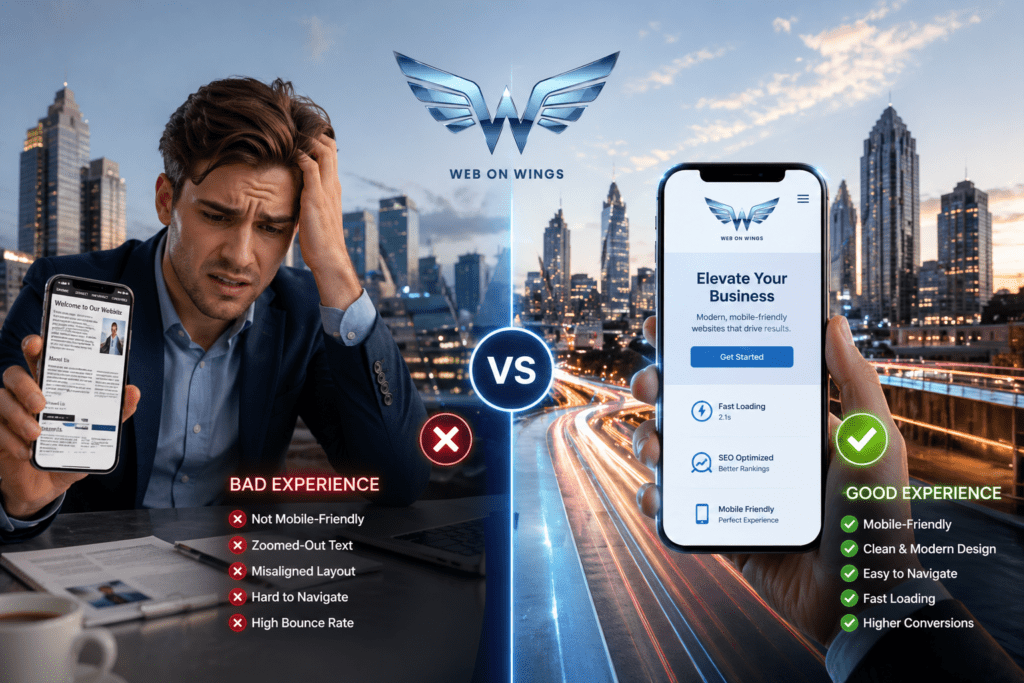
A mobile-friendly website is designed to function perfectly on smaller screens like smartphones and tablets. It adjusts layout, images, and content automatically to provide a smooth browsing experience.
Key features include the following:
- Responsive design
- Fast loading speed
- Easy navigation
- Clickable buttons and links
- Readable text without zooming
Without these features, users quickly become frustrated and leave.
First Impressions Matter More Than Ever
When a potential customer lands on your website, you have just a few seconds to make a strong impression. If your site looks outdated, loads slowly, or is difficult to navigate on mobile, visitors won’t hesitate to leave.
Think about it:
Would you stay on a website where you have to zoom in, scroll endlessly, and struggle to click buttons?
Probably not, and neither will your customers.
Slow loading speeds are killing conversions.
Mobile users expect speed. If your website takes more than 3 seconds to load, most visitors will abandon it.
Common Causes of Slow Mobile Websites:
- Large image files
- Poor hosting
- Unoptimized code
- Too many plugins
Every second of delay reduces conversions and increases bounce rates.
Speed isn’t just important; it’s critical for survival.
Poor User Experience Drives Customers Away
User experience (UX) is everything in the mobile world. If your website is difficult to use, customers won’t stick around.
Signs of Poor Mobile UX:
- Tiny fonts
- Buttons too close together
- Broken layouts
- Pop-ups that block content
When users struggle, they don’t complain; they simply leave and choose a competitor.
Google Prioritizes Mobile-First Indexing
Search engines now rank websites based on their mobile versions first. This means if your site isn’t mobile-friendly, your rankings will suffer.
What This Means for Your Business:
- Lower visibility in search results
- Less organic traffic
- Fewer leads and sales
No mobile optimization = no visibility.
Local Searches Depend on Mobile Optimization
Most local searches happen on mobile devices. People in Atlanta often search for things like
- “Best coffee shop near me”
- “Plumber in Atlanta”
- “Affordable hair salon nearby”
If your website isn’t mobile-friendly, you won’t show up or users won’t stay long enough to contact you.
Competitors Are Already Winning
Your competitors are investing in modern, responsive websites. If your business isn’t doing the same, you’re handing them customers on a silver platter.
What Competitors Are Doing Right:
- Fast-loading mobile sites
- Easy booking systems
- Clear calls-to-action
- Optimized local SEO
Customers choose convenience, and your competitors are providing it.
Mobile-Friendly Websites Build Trust
A clean, modern mobile website instantly builds credibility. On the other hand, a broken or outdated site raises red flags.
Customers Associate Mobile Experience With the Following:
- Professionalism
- Reliability
- Quality of service
If your website looks bad on mobile, customers may assume your business is outdated too.
Higher Bounce Rates Mean Lost Revenue
Bounce rate refers to the percentage of visitors who leave your site without interacting.
Non-mobile-friendly websites typically have the following:
- Higher bounce rates
- Lower engagement
- Reduced conversions
Every bounce is a missed opportunity, and those losses add up quickly.
Social Media Traffic Is Mostly Mobile
If you’re promoting your business on platforms like Facebook, Instagram, or TikTok, most of your traffic is coming from mobile users.
Now imagine this:
A user clicks your link from Instagram…
…but your website is slow, messy, and hard to use.
They leave instantly.
Your marketing efforts become wasted if your website isn’t mobile-ready.
The Cost of Ignoring Mobile Optimization
Ignoring mobile optimization doesn’t just hurt your website; it impacts your entire business.
Hidden Costs Include:
- Lost leads
- Decreased sales
- Poor brand image
- Lower search rankings
In contrast, investing in a mobile-friendly website delivers long-term ROI.
How to Make Your Website Mobile-Friendly
The good news? Fixing your website isn’t as complicated as it sounds.
Here’s What You Need to Do:
1. Use Responsive Design
Ensure your website automatically adjusts to different screen sizes.
2. Optimize Loading Speed
Compress images, use fast hosting, and clean up unnecessary code.
3. Improve Navigation
Make menus simple and easy to access on smaller screens.
4. Use Mobile-Friendly Fonts
Text should be readable without zooming.
5. Add Clear Call-to-Actions
Buttons like “Call Now” or “Book Today” should be easy to tap.
Why Professional Help Makes a Difference
While DIY solutions exist, working with experts ensures your website is optimized for performance, SEO, and conversions.
A professionally designed mobile website:
- Looks modern and attractive
- Loads quickly
- Converts visitors into customers
- Ranks better on search engines
If you’re serious about growth, professional help is worth it.
Future-Proofing Your Business
Mobile usage will only continue to grow. Businesses that adapt now will dominate their markets, while those who delay will struggle to keep up.
Future Trends to Watch:
- Voice search optimization
- Mobile-first shopping experiences
- Faster 5G browsing
- AI-powered personalization
Staying ahead means embracing mobile-first strategies today.
Real Impact: What Happens After Optimization
Businesses that switch to mobile-friendly websites often see:
- Increased website traffic
- Lower bounce rates
- Higher conversion rates
- More customer inquiries
The difference is immediate and measurable.
Conclusion
Atlanta small businesses are losing customers every single day not because of poor products or services, but because of outdated, non-mobile-friendly websites.
In a world where smartphones dominate, your website is often the first interaction customers have with your brand. If that experience is frustrating, slow, or confusing, they won’t give you a second chance.
The solution is clear:
Invest in a mobile-friendly website and transform the way customers interact with your business.
Don’t let your competitors take the lead.
Web On Wings Make your website fast, responsive, and user-friendly and start converting visitors into loyal customers today.
Faqs
1. Why is a mobile-friendly website important for small businesses in Atlanta?
A mobile-friendly website ensures that users can easily browse your site on smartphones and tablets. Since most customers search on mobile devices, having a responsive site improves user experience, increases engagement, and helps convert visitors into paying customers.
2. How do I know if my website is mobile-friendly?
You can check by opening your website on a smartphone. If it loads quickly, adjusts to the screen size, and is easy to navigate without zooming, it’s mobile-friendly. You can also use online tools like Google’s Mobile-Friendly Test.
3. Can a non-mobile website affect my Google rankings?
Yes, absolutely. Google uses mobile-first indexing, meaning it ranks your website based on its mobile version. If your site isn’t optimized for mobile, it can significantly lower your search engine rankings.
4. What are the common problems with non-mobile-friendly websites?
Common issues include slow loading speeds, poor layout, unreadable text, difficult navigation, and buttons that are hard to click. These problems frustrate users and cause them to leave your site quickly.
5. How much does it cost to create a mobile-friendly website?
The cost varies depending on your needs, but it’s an investment rather than an expense. A professionally designed mobile-friendly website can bring long-term returns through increased traffic and sales.